
Click to edit...


INGREDIENTS
Ingredients Focus: Tea
Arguably tea has become synonymous with Britain and one of the most iconic British tea brands could well be Twinings. Even though the company is well-established, a recent revamp of product design has meant that the shelf-identity of the tea stands out amongst the rest. Sonia Sharma finds out more
Tea is both a product and a beverage steeped in history and traditions both ancient and new. According to the UK Tea and Infusions Association, 84% of the British population drink tea and herbal infusions every day, with 165 million cups being drunk daily, or 60.2 billion per year.
And while tea can trace its roots back to more than a century ago, creative and entrepreneurial types continue to reinvent it for a new generation of devotees using novel ingredient sources, unusual flavors and exciting packaging and product design. One of the brands that holds an iconic status, for both tea and Britain, is Twinings. From English Breakfast to Earl Grey, Twinings has been inventing top quality blends since 1706. By broadening its appeal and redefining the tea experience, Twinings has reignited people's passion for tea, making it not only for special occasions, but every occasion. So when the brand decided to launch a limited edition range of teas earlier this year, the company decided to dedicate the design to London. We find out more about the product design.
The Capital City: A Dedication to London
With the capital city the place where it all began for Twinings, the tea brand launched a range of teas dedicated to the city of London earlier this year. The London Edition packs are focused around the unique aspects that make London special: from the architectural landmarks and the vibrant theatre scene, to the diverse fashion and its impressive transport network. Working in partnership with design agency BrandOpus, the four themed packs feature iconic characteristics such as St. Pauls, The Shard and the neon lights of Soho.
Paul Taylor, chief creative officer at BrandOpus, said: “London is a creative hub that inspires us every day in all aspects of our work. It was immensely satisfying being able to catalogue and learn more about our favourite London intrigues. We are extremely proud as Londoners to have created this tribute to Twinings and our wonderful city.”
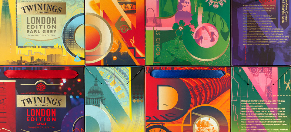
Image courtesy of BrandOpus
Joining Forces: A Long Standing Collaboration
However, this is not the first time the design team and Twinings have come together to reinvent the products. The consultancy is a long-term partner of the brand, and has previously worked on projects including the Infusions and green tea ranges, where the packs use a yellow background and tea leaf pattern to create a glowing effect. Speaking about the partnership and the London Edition packs, Heather Hartridge, marketing director at Twinings UK & Ireland said: “"As strategic partners, BrandOpus have continually demonstrated the business value of design as they’ve worked with us to transform Twinings' on shelf identity."

Product design is an imperative element for upholding the identity of an iconic brand
Last year they also teamed up for the new Discovery Collection, which has a per-serving price three times that of the core range and is aimed at premium grocery and travel outlets. Launched in over 20 countries, so far 25 million cups have been enjoyed by consumers globally. The refreshingly different design solution is a distinctive drawer-style packaging, which features illustrations of natural imagery that code the idyllic origins of the tea with die-cut windows beckoning intrigue and enticing the consumer to explore the inner packaging.
Product design is an imperative element for upholding the identity of an iconic brand, even more so when the product itself holds an iconic status, which is precisely what the company has successfully achieved.
Share this article


